Friday 13 November 2015

A couple of concepts


The General Gist


Moving on with the 'fill' kind of idea I've chosen two of the broken areas which could work quite well and experimented with the phrase 'Make Do Mend'


In terms of materials, I aim to have the type blend in with the natural surroundings as much as possible. If the target audience of this are the residents of the estate then I think they should know well enough what the area looks like to be able to spot something is different, if not then...that's okay too. 
The stone filler will be clay, I'll start by experimenting with that and try to find some more obscure materials to work with. Chicken wire and mud rock for example?
As for the bench slat replacement, I took some measurements of how thick the slats are as well as how wide the gap is; my aim is to have a snug fit so that the type is supported by the slats themselves. I'll experiment with balsa wood to begin with as a test and look at the possibility of using a darker and heavier wood, and then rough it up so it is not clean as a whistle. 


Of course the perspective on this isn't perfect as its drawn free hand but this gives a general idea as to how I'd use the typography to more or less completely fill in the broken stone and level it out.

Again, forgive the perspective, the real thing will be more accurate! I'm really liking the look of these and how they blend more into the background.

A penny for your thoughts

Possible phrases:

  • Make Do Mend
  • Fix this up

I should probably think of some more possibilities.

Not quite up to par

It really is the small details that can change a perspective.

Having ambled around the estate for a fair while i was trying to pinpoint a place for the typography to go and it clicked when I properly stopped to look at the benches. There were twelve of them in this courtyard alone; more around the back of the buildings too. The majority of these benches had some kind of defect, something broken. Having spotted that and other aspects of objects that weren't quite right it felt as though this ideal of a posh neighbourhood was breaking down.
It bothered me more than it should have really.
Thus, there's my idea, I'm going to fix what's broken.

Two front slats missing
Middle slat missing
Bottom corner rusted out, how on earth.
Nothing wrong here, just love how it looks.


Cracked and missing stone
Missing stones

Q&A time incoming

So, with my focus set on the residents of Wedgwood House I need a message to give them. It was invariably the case that the small details began to stand out more and more as I wandered around and this is where the idea stemmed from. I've been rambling about how pleasant the estate actually looks, how it was better than I expected it to be but also how I was unsure of whether it is just a front.
For this I was advised to return to my grid square and talk to the residents themselves to get an idea of what it might be like to live there.
As an example of the possible questions:
  • How long have you lived in Wedgwood House?
  • What is your opinion of living here?
  • If there's something you could change about the area what would it be?
Incredibly generic but in terms of getting a general feel of the place I imagine these types of answers would be helpful.

Chris failed

After wandering around for a fair bit I decided that the China Walk Estate would be a better focus for this project than Lambeth Towers. Yes, my initial research had been more pointed towards the latter but having visited the sites in person now it was clear that I was more drawn to the estate.


If you turn around and look back down the path that you just came from you notice the shops on the other side of the street. Small independent businesses; a bike shop, pizza shop, a small grocers, none of these appeared to have anything too out of the ordinary about them. Glancing back into the estate 
 gives a very different feeling. This comes across as something higher class, perhaps it's the courtyard that does it, perhaps it's all just a front; I don't know. I would need to do more research on these houses.


It is for this reason that I have decided to target my piece of typography at the residents of China Walk Estate; specifically at those living in Wedgwood House as that building by itself makes up the majority of the estate.


The people seem interesting, this Lucozade bottle for example; a piece of litter thrown down in this pretty area but in addition to it being litter there is a label that reads 'Chris please bring bottle home'
Chris apparently failed in this task.

Onto bigger and better things

Wedgwood House

A minutes walk down from Lambeth Towers is China Walk Estate.


When I first saw this amount of flats on the map we were given I didn't know what to expect  but what I found certainly wasn't it.

One of the many entrances at China Walk Estate


A view of Wedgwood House

I was pleasantly surprised to discover that the whole estate was much more appealing than originally thought. I enjoy the style of these buildings and to have them circling a courtyard  is an agreeable feature. However, as decent as these buildings looked it did not give me a conclusive answer on what kind of people live here.
Having looked up one of the addresses on Zoopla.com I found out that a 1 bed, 1 bath, 1 recept flat costs approximately ; £347,000; this is higher compared to the rest of the UK average of about £275, 000 now


A bit of background on an enchanting eyesore

Lambeth Towers

Designed by George Finch in 1964, it is considered to be a masterpiece of his. The towers were to provide affordable, high quality housing spanning 10 stories, medical facilities and arguably most importantly, a lunch club for the elderly.

Brochure to Lambeth Towers scheme promoting it as a social and ideal place to live.


Lambeth Towers generally seems to have remained the same over the past few decades however the one difference I must regret to inform is that the elderly persons' lunch club no longer exists. Instead, it has been replaced with a very orange Thai restaurant. I was looking forward to seeing that lunch club too...


Lack of elderly person's lunch time clubs aside, as it turns out Lambeth towers may well be a part of Brutalism, a movement in architecture that boomed in the 1960s and 70s. They are characterised by continuous repeated elements and concrete. Lots of concrete. Said to be used for its 'raw and unpretentious honesty.'

Trelick Tower, London, 1966-1972

http://fuckyeahbrutalism.tumblr.com/

Please see above for further examples of concrete right angles and buildings that look like they may have been exported from Minecraft.

ref: http://www.utopialondon.com/lambeth-towers

Getting my bearings

One of the key landmarks that I decided to base most of my research on was Lambeth Towers.


Lambeth Towers sits rather imposingly on the corner of Kennington and Lambeth Road. Having looked up the building online beforehand I immediately thought, nope, not a fan of that, it's pretty damn ugly.
However.
Having now seen it for myself I may have warmed up to it...somehow. There's a strong urge to wrinkle my nose upon seeing the odd formation of the flats but simultaneously I find it absolutely fascinating and I can't quite pinpoint why. It certainly stands out at least.


First impressions of J1 South

Sums it up quite well.

Brief time

Word Up!

Brief: Design a provocative piece of site-specific 3D typography.


 I was assigned square J1 which I then christened J1 South. Initial research of this was of course finding out what the heck was in the area. I'd never been to Lambeth so this was all new and I ended up enjoying the place more than I imagined, 10/10.

Word Up! - Initial Research

Word Up!

Initial Research Brief

Examples of 3D typography


When 3D typography was mentioned this was the first thing to come to mind, having visited the Netherlands twice and seen it in person I have a bit of a soft spot for it. Absolutely love the colours and the clever smushing of the words.


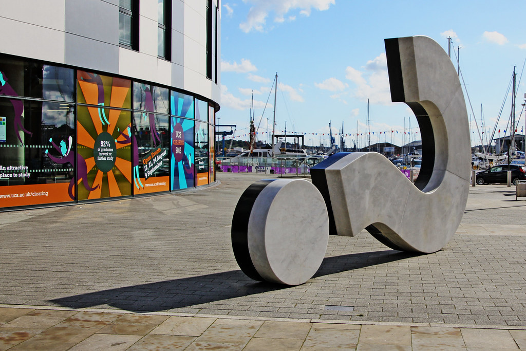
A question mark made of marble and granite commissioned by University Campus Suffolk for their campus on the waterfront. This is in my hometown. I remember it being controversial when the plans were announced. It cost £200,000. Yeah.


Admittedly I don't have any background on this other than that it is in New York City. Something about the look of the letters as well as being able to see the joints and unlit curves is really appealing to me.

These were also some other pieces of 3D typography I considered, although 3D in a virtual sense, I wouldn't complain with a life sized Minecraft logo though.